Your cart is currently empty!

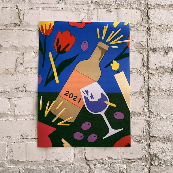
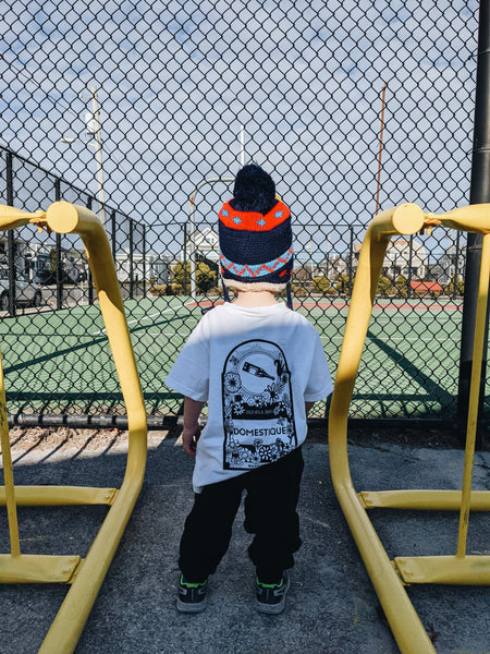
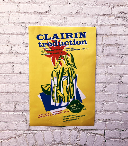
We asked one of our favorite artists, Milena Bucholz, to design a poster for us marking the finale of 2020. Milena has designed many wine posters and wine labels (including our anniversary poster last year and the labels for La Boutanche) and is known for her bright, expressive colors. We love the poster she made us this year because it's beautiful, somber, and powerful. The color is there, but it's muted.
About the Artist
Milena Bucholz is an artist and designer based in Paris, who is most know by us for her amazing "La Boutanche" designs. This is a short interview with Milena via email (thank you Google translate).
Tell us a little bit about "who" you are...whatever that means to you: It is quite hard for me to describe who I am but I'll try my best. I am (she/her) born in France, but never really felt French if I am being honest. My mom was born in Guadeloupe, a tiny island in the Caribbean's and dad is half German born in Jura. There was always a strong sense of cultural "otherness" at home.
How did you start working in design and then start designing wine labels and posters? Like most people who feel like they don't belong, I went and try art school for a bit, specialized in graphic design, thinking I'd draw all day. I figured graphic design is not illustration so I dropped out and left the educational system. Years later I opened a wine shop in London, and took care of the shop's visual identity. Customers and friends seemed to appreciate it and would ask me to design stuff for them. Mostly posters, and mostly wine related.
What makes for a great label? Why does it matter? When I'm asked to do a wine label, I always think about the winemaker and the customer. It needs to make the winemaker proud, it also needs to stand out on the shelf so that customers notice it. So I tend to give informative content little to no space, and let the illustration shine. That's my personal approach. I've always found the wine world very elitist and pompous, and I think the world have seen enough wine labels with a castle on it...I want label to spark interest, regardless of who you are, what you know etc.
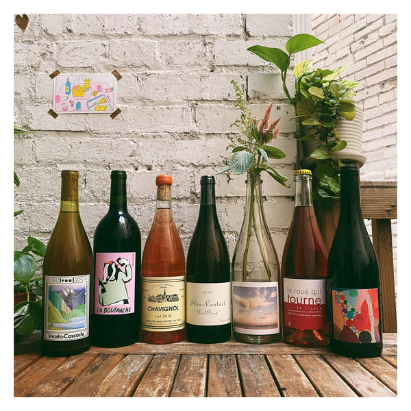
That said, I was lucky enough to design labels/posters for like minded people, which really helps.. My first wine label was for Selection Massale, hands down funniest brief. Guilhaume (we met a while ago through an ex of mine) contacted me about his new venture, "la boutanche," a collaborative liter of wine between Selection Massale and their favorite winemakers/growers. They wanted something fun, echoing drinking at BBQs, so we ended up with a tipsy pig holding a magnum.
What other labels, designs, art do you love? As far as art that i love, there's way too much, but I'll try to narrow it down. I always go back to illustration and graphic design from the 60's era: Emory Douglas, Tadanori Yokoo, Aquirax Uno, Awazu Kiyoshi, John Alcorn, Roland Topor, ect...
I'm obsessed with Jean Cocteau, a multidisciplinary French artist who looked at life as poetry. The work of Elizabeth Catlett, which couldn't be more relevant these days. The work and philosophy of Charlotte Perriand.
What do you like to drink?! I like bubbles, Les Capriades, Laherte Frères...
Otherwise: Herve Villemade, Chanudet, Cantina Giardino, Cantina Furlani... that's the tip of the iceberg. And of course my gran spiced rum from Guadeloupe.


